An identity that connects: the new DAFRAM brand
DAFRAM opens a new chapter in its evolution with a rebranding project that redefines how the company presents itself and positions its identity.
In an increasingly complex and constantly evolving industrial context, it is no longer enough to simply communicate what you do; it becomes essential to explain why you do it and what you generate. This awareness guided our journey and was our starting point: an analytical and strategic development process carried out together with Acanto studio, which led us to the creation of a new brand identity, more coherent, distinctive, and contemporary.
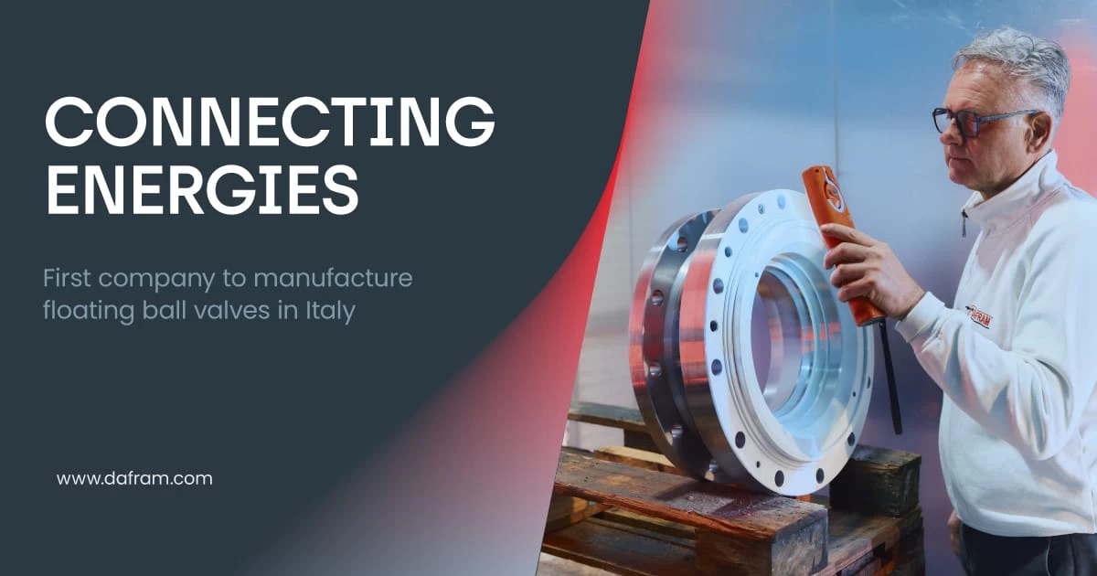
At the heart of the new positioning is a reinterpretation of our flagship product: the valve. No longer just a technical component, but a real and true connection device. An element capable of linking forces, regulating flows, creating balance, and activating new possibilities.
This is from where the “Connecting Energies” concept takes shape. We are talking about energy not only in a technicalproductive sense, but also as a set of skills, ideas, and relationships: connections between technological and human systems that contribute to the generation of value.
This vision is expressed through a new visual system, where every element reinforces the meaning of the brand. The logo is its synthesis: the graphic sign - two shapes converging at a central point - becomes an essential, minimalist pictogram subtly evoking the shape of ball valves, while the clean, contemporary logotype conveys the brand’s solidity and recognisability.
From that point of connection, the visual language comes to life, with a gradient that develops and expands outward from the center, making visible the energy generated by the parts coming together. It is not just an aesthetic choice, but the expression of a principle: connection as activation, as a force that spreads and feeds the system.
For us, connecting energies means exactly this: creating the conditions for something to happen, to transform, to evolve.